![]()
A New Look
Harvey’s Home Heating is an established company with a long history of helping people stay warm.
While Harvey’s branding has always leaned traditional and corporate, our home heating customers have always known us to be approachable, friendly, and focused on service, which is why we’re maintaining our Warmest Friends tagline.
This sets the stage for our brand refresh, which demonstrates those same attributes to new and potential customers. When it comes to separating the house-hold and business-to-business sales stream, we’ve used the primary colours of red and blue on separate logos.
Personal Service
Harvey’s has a special connection to those it services in Newfoundland and Labrador. With this new brand expression we highlight that relationship by leading with our warmest friends tagline, rather than following with it.
The font we chose is Lato Black. The all-caps treatment makes the brand feel bold and powerful, but by softening the colour to a warm grey with red highlights reminiscent of the Petro Canada logo, the feeling is more inviting than stiff or cold.
This new brand is the perfect balance of professional and friendly.
The additional logos (A. Harvey and Petro-Canada) offer credibility and trust as both brands are recognizable and offer huge brand power. Meanwhile, they can be removed easily should they need to be, and the Harvey’s Logo will stand strong on its own.
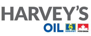
Professional Offerings
Harvey’s has professional relationships with many businesses in the marine, construction, transportation, manufacturing and other sectors in Newfoundland and Labrador. With new wordmark logo, we highlight the professionalism and service the company offers.
The font we chose is Lato Black. The all-caps treatment makes the brand feel bold and powerful, but by softening the colour to a warm grey with primary blue highlights, reminiscent of the A. Harvey logo, the feeling is more inviting than stiff or cold.
This new brand is the perfect balance of professional, experienced and approachable.
The additional logos (A. Harvey and Petro-Canada) offer credibility and trust as both brands are recognizable and offer huge brand power. Meanwhile, they can be removed easily should they need to be, and the Harvey’s Logo will stand strong on its own.